Hermes Suitcases
Tangerine Tango Pantone 17-1463: I am totally diggin this one and my new fav nail polish happens to be this very color. It's that Insta Dri stuff which honestly, I dont know how I got along without.Solar Power Pantone 13-0759: I adore yellow but I have discovered the trick is using it in small batches. I often tell my clients that if they want to highlight a color, try isolating it. If its the only thing that color, trust me you will notice it, this creates a focal point. Just because I love yellow doesn't mean I should paint my whole downstairs yellow, which I've done.
Bellflower Pantone 18-3628: Kind of a soft purple with warmer undertones. I could see it pairing nicely with a variety of skin tones if you were to wear it.
Kate Moss
Cabaret Pantone 18-2140: Kind of a Barbie pink but a more grown up version. Its bright and seductive and I could see it doing well in a master bathroom paired with some white marble.
Street Style Vogue
Sodalite Blue Pantone 19-3953: Deep cobalty looking blue that looks rich with almost any other color you pair it with. I especially like it paired with the above Cabaret pink.
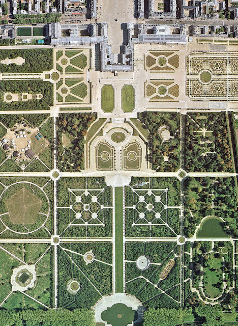
Versailles
Margarita Pantone 14-0116: Light mossy green that has a yellowish undertone.This color makes me think of wedding season. I like it paired with stronger colors and staying more in the background versus it being the star of the show. Funny fact; my senior prom dress was this color.
Sweet Lilac Pantone14-2808: My mom loves this color but she is always been a little scared to use it. I agree that it is an easy color to fall in love with, paint all over your house, and then realize its too strong. Don't be afraid to ask the guys at the paint counter to cut a purple that you like in half with some white. The difference between doing that and just going with the lighter shade on the chip card is that sometimes they add additional undertones to those colors to get them darker. When you cut with the white you still have the same undertones and will get a different result. Almost everyone is doing sample jars now and it is easy for them to mix it up quickly. Some of the best colors I have used have been altered in some way from the original.
Cockatoo Pantone 14-5420: I am so happy this color is back from the grave of the 80s. Electric and sassy, most blues have a calming effect, but this one energizes me and makes me want to dance. It is an unquestionable color staple in a woman's closet. You wear this blue for a night out on the town and I promise you, people will look.
Driftwood Pantone 18-1210: How do you even describe this color? It's a purple, grey, brown color I guess? It changes and morphs depending on the light which makes it perfect for transitional spaces like this one. I also appreciate it's flattering qualities when used in fashion. Chanel suit? don't even get me started on that one, I'll gush for hours.
Starfish Pantone 16-1120: The hardest thing for me to do is stay monochromatic like in this picture. I like it, but something deep within me wants to put a pop of red or magenta in this room. Restoration Hardware has mastered this effect, maybe it's my rebellious side that wants to break free from it. Who knows...
In the picture above Pantone paired them up.


No comments:
Post a Comment
Comments