Dreamy Dreams in Technicolor

Pin It I have been having the weirdest dreams lately. They all have been totally vibrant and remind me of the technicolor in Wizard of Oz. Which got me thinking about colors for Spring and Summer. Here is what the Pantone Color Report says.

Hermes Suitcases
Tangerine Tango Pantone 17-1463: I am totally diggin this one and my new fav nail polish happens to be this very color. It's that Insta Dri stuff which honestly, I dont know how I got along without.


Solar Power Pantone 13-0759: I adore yellow but I have discovered the trick is using it in small batches. I often tell my clients that if they want to highlight a color, try isolating it. If its the only thing that color, trust me you will notice it, this creates a focal point. Just because I love yellow doesn't mean I should paint my whole downstairs yellow, which I've done.


Bellflower Pantone 18-3628: Kind of a soft purple with warmer undertones. I could see it pairing nicely with a variety of skin tones if you were to wear it. 

Kate Moss
Cabaret Pantone 18-2140: Kind of a Barbie pink but a more grown up version. Its bright and  seductive and I could see it doing well in a master bathroom paired with some white marble.

Street Style Vogue
 Sodalite Blue Pantone 19-3953: Deep cobalty looking blue that looks rich with almost any other color you pair it with. I especially like it paired with the above Cabaret pink. 
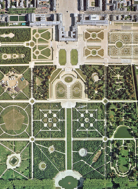
Versailles
Margarita Pantone 14-0116: Light mossy green that has a yellowish undertone.This color makes me think of wedding season. I like it paired with stronger colors and staying more in the background versus it being the star of the show. Funny fact; my senior prom dress was this color. 


Sweet Lilac Pantone14-2808: My mom loves this color but she is always been a little scared to use it. I agree that it is an easy color to  fall in love with, paint all over your house, and then realize its too strong. Don't be afraid to ask the guys at the paint counter to cut a purple that you like in half with some white. The difference between doing that and just going with the lighter shade on the chip card is that sometimes they add additional undertones to those colors to get them darker. When you cut with the white you still have the same undertones and will get a different result. Almost everyone is doing sample jars now and it is easy for them to mix it up quickly. Some of the best colors I have used have been altered in some way from the original.


Cockatoo Pantone 14-5420: I am so happy this color is back from the grave of the 80s. Electric and sassy, most blues have a calming effect, but this one energizes me and makes me want to dance. It is an unquestionable color staple in a woman's closet. You wear this blue for a night out on the town and I promise you, people will look. 


Driftwood Pantone 18-1210: How do you even describe this color? It's a purple, grey, brown color I guess? It changes and morphs depending on the light which makes it perfect for transitional spaces like this one. I also appreciate it's flattering qualities when used in fashion. Chanel suit? don't even get me started on that one, I'll gush for hours.


Starfish Pantone 16-1120: The hardest thing for me to do is stay monochromatic like in this picture. I like it, but something deep within me wants to put a pop of red or magenta in this room. Restoration Hardware has mastered this effect, maybe it's my rebellious side that wants to break free from it. Who knows...


In the picture above Pantone paired them up.

Crazy Lady Rattan Harvest

Pin It
On one of my frequent trips to the landfill I saw this guy throwing out a perfectly good outdoor rattan set. Sure it needed some love but I always got plenty of that for furniture. It was a vintage set the kind that was popular in the 60s and 70s. Vintage furniture from that time period holds a particularly large spot in my heart, and seeing this set in the back of this man's truck made me think of how many amazing cocktail parties must have surrounded its now faded frame (back in the day).  For those of you that don't know, rattan back then was the straight up business. Wicker furniture has been around since the beginning of time it seems and originated in, you guessed it, China. It wasn't until Wakefield (a furniture making company in the good old USA) got their hands on it and basically cornered the market.  The stuff got real popular in the days of flower power and Mad Men (who doesn't love that show?), and that is what drove me to approach this man like a crazy person and harvest the furniture out of his truck and into mine. So began my weekend project.

 This is what I started with. It had no seat to it at all and the wood was in kind of rough shape. I wanted to keep it light and bright so I opted to spray paint the whole thing white. I just used regular matte white spray paint that was made for going over wood. No need to get too fancy considering this set will be outdoors.

 I went to Home Depot with my measurements and got this particle board cut to fit for the seat of the outdoor sofa and two chairs that came with the set. Particle board is cheaper than plywood and holds up fine for this application. They will cut it for free at Home Depot all you have to do is buy the whole sheet of particle board which cost me roughly $11.
 Here you can see I have my priorities straight in terms of the supplies needed to do the job correctly. I also had a mini boombox going which got rather silly later when my neighbor and her cute two year old son decided to have a outdoor dance party with  me...which I loved!

 I already had these outdoor cushions but they were really dirty and not the right size for my rattan set.

 Since the stuffing inside the cushions was made to be rained on thousands of times I decided to re-purpose it by taking it out of the dirty cushion covers and laying it out in the appropriate thickness onto my particle board seats I had cut.
 I didn't want to spend a whole lot of money on this project but I needed some outdoor fabric to cover the seats with so I went with drop cloth canvas. It is way cheaper than buying outdoor fabric. It holds up well in outdoor weather and is easy to maintain. I also really like the look of it. I spent $9 on this for the seats.

 I upholstered the particle board seats that had the foam I re-purposed, and did the old pull and tuck method to get a smooth seat.
 I don't know what I did before I owned this staple gun. I actually got it for free at a Ron Paul rally during the last presidential election. I was going though a political activist phase. As you can see it was worth it.

 Ok, so this is my back deck now and I love it! I need to get a few more pillows for the back of the seats but I can worry about that later. For now these are a really nice addition to the outdoor space. My dogs think they are little kings because these are the only seats they are allowed to lay on so you can imagine the little egos that have been developing around here.
 I think every outdoor space needs a little Christmas light romance. This is a sweet LED rope light that puts off the best warm light. I swear they are getting so good with these LEDs.

Come on over to my back yard!

Neon is back? or...Neon is wack?

Pin It Couple of current projects have been keeping me busier than a one legged cowboy in a kicking contest.

For starters I have finally become an Llc, the good old secretary of state and all the people that work there have become my recent BFFs.

My client's master and kids bath project has entered the selection phase. My original sharpie drawing concepts are evolving beautifully into paint samples and tile samples. Which is always exciting because seriously, I could shop for anything. I probably could shop indefinitely.

I also have a condominium project in downtown Raleigh that recently had the furniture delivered from Highpoint market.

Which reminds me, I need to learn how to be a better photographer. 

Then there is the bar in downtown Raleigh that if we push will open in about three weeks. We recently covered all the windows to keep it a surprise. I love the drama of an unveiling. The opening of Clockwork will be a welcomed bittersweet moment for me. I am ready for the next bar project and hopefully it will be in Brazil or Miami, girl can dream right?

Ok enough about work, lets talk about the recent neon trend that I am seeing everywhere. I mean, I just don't think I could fall more in love with fashion. I am impressed by it on a daily basis. You cannot tell me that neon pink doesn't awaken something inside of you.

 Maybe it was my obsession with Barbie when I was a little girl (and now) that makes me love it so much. Barbie did invent that color I am pretty sure. The funny thing about Barbie is that I wouldn't really play with them as much as I set up their houses. My sister and I would set up entire Barbie neighborhoods on the floor of our bonus room growing up. You couldn't walk in there without stepping on something. My poor dad learned early on not to try.

I am pretty sure Barbie's modern day real life house would look something like this. I am also sure she would hire me to help her design it. We would get coffee together and talk about Ken and how he has commitment issues.


Prada.


Jason Wu spring 2012


Maya Hayuk


Ok, it's not just because it's Chanel. It's because the contrast of this photo is appealing to me. Neon on an old brick wall. Ok it's because it's Chanel.


Kelly Wearstler 


Art installation


Street Style Vogue


Love this lip color


Cant forget the old Las Vegas signs.


For Rosario


Street Style


Street Style


Street Style


Street Style


Paris Street Style 


I need these shoes and these pants

Also check out my side business Raleighgroutandtile.com